Code Modules — Docs
Elements Module
Elements Module
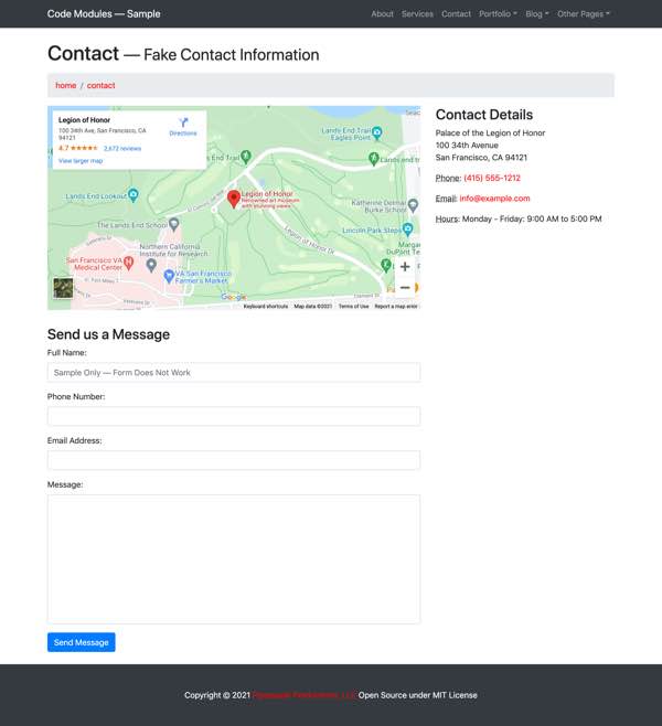
Screenshot of the Contact Page on the Sample Website. Both the Google Map embed and the Contact Form are pulled from the Elements module.
Introduction
Websites usually have pieces of markup that don’t deserve a whole module — rather, they need something akin to a traditional include. It can still be handy to put them into a separate file and be able to replace global variable names inside them with their values. I use a special Elements module for this purpose. It’s found at app/modules/elements/ and, like all modules, is called through its entry file at the module’s root entry.shtml file.
Examples of items appropriate for the Elements module are a form, an action button, an iframe (i.e. a Google map), specialized Schema markup like an address vcard, and so on. Each of these can benefit from being encapsulated in their own file and called from parent web pages as needed.
The Elements module is more free-form than the other modules. It doesn’t need lists/, and types/ folders. Each item needs to just return markup, often using global variables. For simple sites, I put all these files into the items/ folder; that’s how it’s done on the Sample Website. If that gets too disorganized, I’ve split the items into separate subfolders which describe their content: buttons/, forms/, iframes/, contact/, and so on. Then calls to the Elements module would have to have separate variables for both the folder (buttons/, forms/, etc) and the item. The two variables would be used in the Elements module entry file’s calling path to access the particular item sought.
An item in the Elements module can call another item in the Elements module. Imagine a form with a submit button. One can keep the markup of all the submit buttons used across the site within a single include. The form can make a call to the Elements module for that submit button — always going through the Elements module’s entry file. If a change is desired to the site’s submit buttons, it will just require a change to that single item in the Elements module.
Icon Example
Problem
The Sample Website uses Font Awesome for icons. Font Awesome requires a particular markup syntax. It would be nice for the maintainer to be able to add an icon without worrying about that markup syntax. It’s also desirable to be able to swap out another font system for Font Awesome should the need arise in the future, adjusting the syntax in one place rather than all across the website.
Desired Result
<i class="fa fa-chevron-right fa-1x" aria-hidden="true"></i>Call to Elements Module
A call to the Elements module icon item from the parent file looks like the following. First shown is a full version with comments, second is the version which would ordinarily be used. The #COMMENT# variable is just explanatory. The #ICON-CLASS# variable can be omitted — it has a default value defined globally but can be overwritten in the call to the Elements module.
1<!-- #bbinclude "/elements/entry.shtml"2#bbincludeoptions#="inline=true"3#ITEM# = 'icon'4#ICON# = 'chevron-right'5#ICON-CLASS# = '#ICON-CLASS#'6#COMMENT# = 'ICON-CLASS is optional; defaults to fa-1x. Can be fa-lg, or fa-2x, fa-3x, fa-4x, fa-5x for size. Can include fa-fw for fixed width. Can include fa-li for use in lists. Can include fa-spin or fa-pulse to animate. Can include classes to flip and rotate: fa-rotate-90, fa-rotate-180, fa-rotate-270, fa-flip-horizontal, fa-flip-vertical.'7-->8<!-- end bbinclude -->1<!-- #bbinclude "/elements/entry.shtml"2#bbincludeoptions#="inline=true"3#ITEM# = 'icon'4#ICON# = 'chevron-right'5-->6<!-- end bbinclude -->Element Files
The entry.shtml entry file looks like:
1<!-- #bbinclude "items/#ITEM#.shtml"2#bbincludeoptions# ="inline=true"3#MODULE# = "elements"4-->5<!-- end bbinclude -->As in all modules, the #MODULE# variable is defined in the entry file with the same value as the module’s folder name. The real action is in the variable #ITEM#, defined in the parent’s call to the Elements module (here “icon”), used in the entry file’s call to its child (here “items/icon.shtml”).
The Icon item from the Elements module looks like:
1<i class="fa fa-#ICON# #ICON-CLASS#" aria-hidden="true"></i>Contact Form Example
Imagine you had a complex bit of markup that would be handy to stash away - encapsulating its complexity. This contact form, taken from the Modern Business template used for the Sample Website, is an example. In this case, the include is identical to the final markup, but an Element module item can be stuffed with global or passed variables as well:
1<!-- In order to set the email address and subject line for the contact form go to the bin/contact_me.php file. -->2<form name="sentMessage" id="contactForm" novalidate>3 <div class="control-group form-group">4 <div class="controls">5 <label>6 Full Name:7 </label>8 <input type="text" class="form-control" id="name" required data-validation-required-message="Please enter your name." placeholder="Sample Only — Form Does Not Work">9 <p class="help-block">10 </p>11 </div>12 </div>13 <div class="control-group form-group">14 <div class="controls">15 <label>16 Phone Number:17 </label>18 <input type="tel" class="form-control" id="phone" required data-validation-required-message="Please enter your phone number.">19 </div>20 </div>21 <div class="control-group form-group">22 <div class="controls">23 <label>24 Email Address:25 </label>26 <input type="email" class="form-control" id="email" required data-validation-required-message="Please enter your email address.">27 </div>28 </div>29 <div class="control-group form-group">30 <div class="controls">31 <label>32 Message:33 </label>34 <textarea rows="10" cols="100" class="form-control" id="message" required data-validation-required-message="Please enter your message" maxlength="999" style="resize:none"></textarea>35 </div>36 </div>37 <div id="success">38 </div>39<!-- For success/fail messages -->40 <button type="submit" class="btn btn-primary" id="sendMessageButton">41 Send Message42 </button>43</form>Instead of having this clot of markup in the parent file, instead there's a call to the Elements module:
<!-- #bbinclude "/elements/entry.shtml"#bbincludeoptions# ="inline=true"#ITEM# = 'form-contact'--><!-- end bbinclude -->Use the Elements module when you need something like a traditional include. Use a dedicated Markup module when you have repeating elements that use the same markup.
I often start with some content in the Elements module and later find that it is better served by being placed into its own Markup module. A list of services, for example, might start in the Elements module as a simple <ul> list. But when the list needs its format or content changed on a different page, I graduate it from the Elements module to a new dedicated Markup module called services. Duplicating the Blank Markup Module makes this easy.